The Evolution of Kurkure Packet Designs Over the Years

As one of India’s most beloved snacks, Kurkure has carved a unique space for itself with its flavourful snacks and distinct brand identity. The brand was first launched in India in 1999 and has managed to retain its stronghold with its iconic collets for more than two decades.
Over the years, the humble Kurkure packet has evolved to keep pace with changing trends and consumer preferences. Despite intense competition from both organised and unorganised players, Kurkure has managed to retain admiration and love among snacking enthusiasts country-wide.
Kurkure Packet: Design Journey
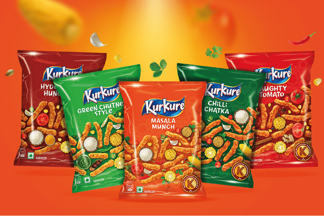
The journey of packaging with Kurkure is a story of adapting trends while retaining its unique brand identity. With every redesign, the Kurkure packet has managed to have a refreshed look while successfully capturing consumer attention. Let’s dive into this design transformation and explore how the Kurkure packet truly reflects the brand’s journey.
The Classic Design
When it first launched in India, the Kurkure packet was designed in a simple yet captivating manner. Featuring vibrant colours like orange and yellow, Kurkure made sure it was considered a fun and bold brand.
It was instantly recognisable, with its logo designed in a playful font. In addition to these aspects, the early design focused on the product and its key selling point – a crunchy and delicious snack that was an important part of family gatherings.
The Modern Transition
As the popularity of Kurkure surged, its packaging also donned a new appearance. This time, the colours got more intense and the graphics more striking to appeal to the younger demographic.
This packet design of the mid-2000s also witnessed a more prominent use of brand ambassadors, establishing a stronger connection with Indian pop culture.
Special Editions and Festive Packaging
Always in tune with Indian traditions and festivals, Kurkure designed special edition packaging, embodying the festive spirit. These packets were also designed with vibrant and celebratory colours such as gold, green, and red, and contained traditional motifs and cultural symbols.
This strategy cemented Kurkure as a snack that is an important inclusion in every festive celebration.
In addition to the clever design elements of the Kurkure packet, the brand also employed some key marketing strategies to anchor itself as a key teatime snack.
Kurkure’s Winning Marketing Formula
- Brand Awareness: Kurkure knows exactly how to engage the Indian consumer and has extensively used several methods, from TV and social media to in-store displays. Their innovative ad campaigns, paired with catchy jingles and celebrity endorsements, have played an important role in establishing a strong brand presence.
- Market Penetration: In addition to visibility, Kurkure has also been a highly accessible brand. Whether it is local stores, large supermarkets or e-commerce platforms, Kurkure products are available across the country.
- Product Differentiation: What sets Kurkure apart is its distinctive and flavourful colletts, which are tailored to Indian tastes. From spicy to tangy, there is something to satiate every kind of craving.
Wrapping Up
The signature Kurkure packet is a testament to its ability to remain fresh in the minds of consumers. Every new design – whether it is the Kurkure festive collection, the packet’s classic colours, or even its ambassador announcements – the brand tells a compelling story through every transition.


